Description
Several people have asked if these Foundational Hand guidelines were for sale. I have been hesitant to sell these guidelines for a few different reasons that I am going to share with you for the sake of transparency. First, I am not a professional calligrapher or a certified teacher, I am just an enthusiastic student with a background in digital art. Second, please note that some teachers don’t really approve of such guidelines, especially ones that are so geometrical because they believe in a more organic learning process. Third, these are designed for A4 sized paper because that’s the size of the sketch pad I was using at the time and they were not designed for letter sized printer paper. Fourth, these were made back in 2016 and I don’t know what I did with the original Photoshop files, so I don’t know that I can accommodate any requests for changes.
Now that all the disclaimers are out of the way, a little introduction.. I made these guidelines back in 2016 out of frustration. I was new to traditional calligraphy and I couldn’t draw a straight line to save my life. I was so discouraged that I couldn’t write the basic alphabet without lines swerving and veering off regular guidelines and by the looks of how shaky my letters were, you would have thought that I was a nervous wreck. So all I really wanted, were some training wheels. I was tired of spending week after week looking at a mess of letters. I just wanted a little bit of help as a beginner so that I could learn the proportions of the letters without feeling so downtrodden by the miserable state of my shaky lines.
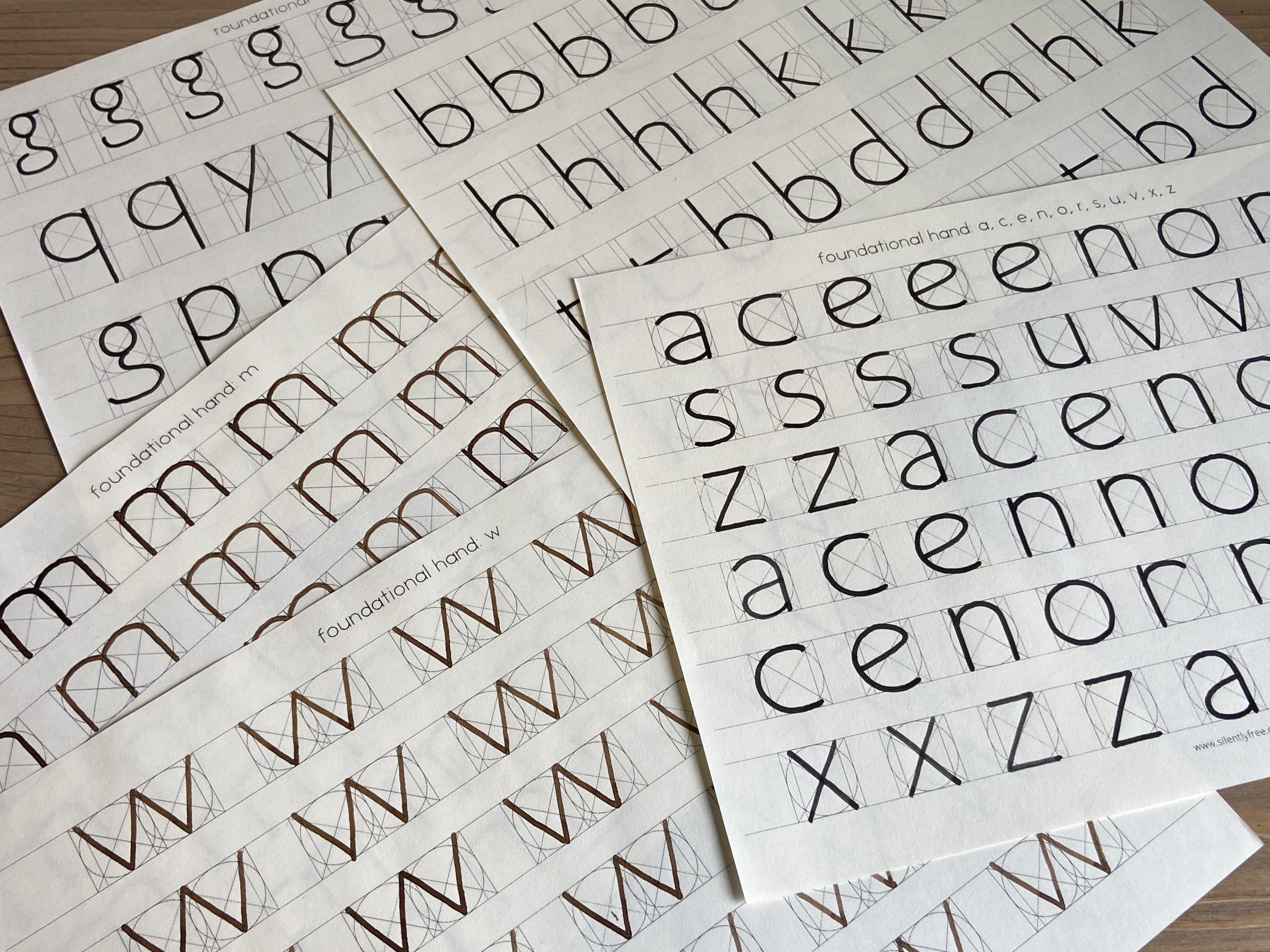
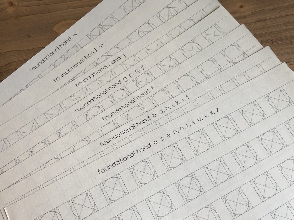
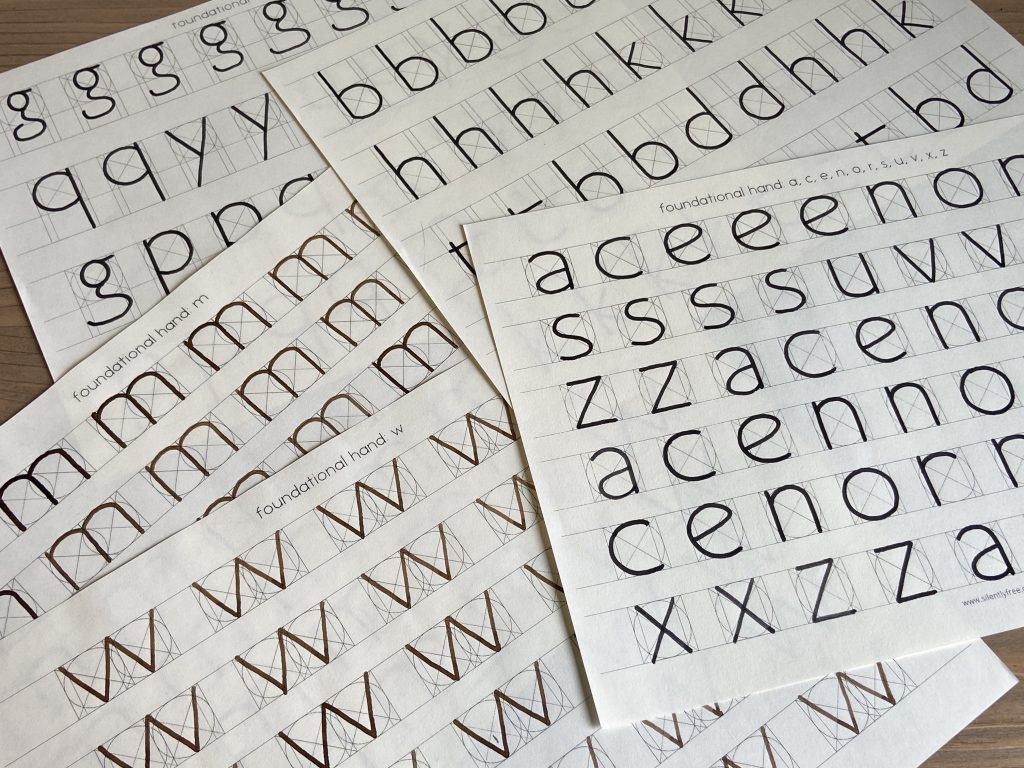
Then I took a Foundational Hand class taught by Scarlet Woo(@scarletwoo), and she gave me a guideline that had a geometric box. It is basically the skeletal proportions box that you can see on page 10 of Foundations of Calligraphy by Sheila Waters, or pages 31-33 of Contemporary Calligraphy by Gillian Hazeldine. However, while the guidelines with the basic box was wonderfully helpful for the letters a, c, e, n, o, r, s, u, v, x, and z, it was still a bit frustrating when I was trying to practice letters with ascenders, descenders, and particularly with the letters m and w.
So in the end, I set out to make my own guidelines. There were a few requirements that these guidelines needed to meet. I wanted to make guidelines for every single letter of the alphabet with accurate proportions, and because I wanted to get the most out of the paper, I wanted to fit as many letters as I could on each sheet. All my art teachers are shaking their heads and putting their face in their palms right now, because all of my teachers have told me time and time again about the importance of margins. I respect that. I really do. In fact, I observe the 1-2 inch margins whenever I do my homework. However, these guidelines are purely for practice, and while many teachers feel strongly that you need to use margins in your practice to train your eye when you are doing actual work, I couldn’t stand wasting so much paper in the margins when I was going through anywhere between 10-20 pages per day. So these guidelines do not have a fixed margin size. I’m so sorry if that bothers you, but basically I made the guide and then fit in however many I could while still having a reasonably tolerable margin in between the letters and on the 4 edges so that the guidelines wouldn’t get cut off during printing.
There were some difficulties during the creation process. The guidelines had to be light enough so that they wouldn’t feel so overpowering while practicing, but dark enough that you could see them comfortably without having to strain your eyes. Of course I had a wonderful time wrangling Photoshop to actually make my lines visible when printing them. I thought I would only need to make 3 versions, one for letters without ascenders or descenders, one for letters with ascenders, and one for letters with descenders. Well, after some trial and error I found that f and j need their own guidelines, and m and w need two boxes put together so they need their own guideline too. Then imagine my frustration when I thought I was finally finished, to discover that you can’t use the same guideline for m and w, it simply does not work. So I made a separate guideline for m and w.
Once they were tweaked to perfection though, they worked brilliantly. I think I must have written at least 10 pages for each letter of the alphabet, and over the years when I needed to just reset my mindset or brush up on the basics all I had to do was pull up these pdf files and print off another batch. Once you get a good feel for the geometric proportions of the letters and how they relate to each other, you can move on to hand drawn guideline on larger practice paper, but until then I loved practicing with these guidelines on A4 paper because it was also readily portable. On hot summer days I like throwing a few of these in a file folder and heading off to a local cafe to enjoy practicing with coffee and air conditioning.
As for the pricing, the reason why the italic guidelines are free whereas the Foundational Hand guidelines are not, is for a few different reasons. First, I wanted to give back to the community in some small way. I have received so much help and advice during my practice that I wanted a way to pay it forward. As italics are the way I was first introduced to calligraphy long ago, I decided to make the italic guidelines free. Second, the italic guidelines were considerably easier and less time consuming to create. The Foundational Hand guidelines were also developed over several iterations as I went through trial and error in the design. So the price reflects the time, energy, and research that went into creating these guidelines, the number of guidelines included, and the fact that you can print off as many copies as you’d like for as long as you’d like. I hope you will please be considerate and not distribute these guidelines for free or use them for commercial purposes or personal gain, as I have put a lot of passion and energy into creating these guidelines. In return I am taking the time to share a few extra tips with you:
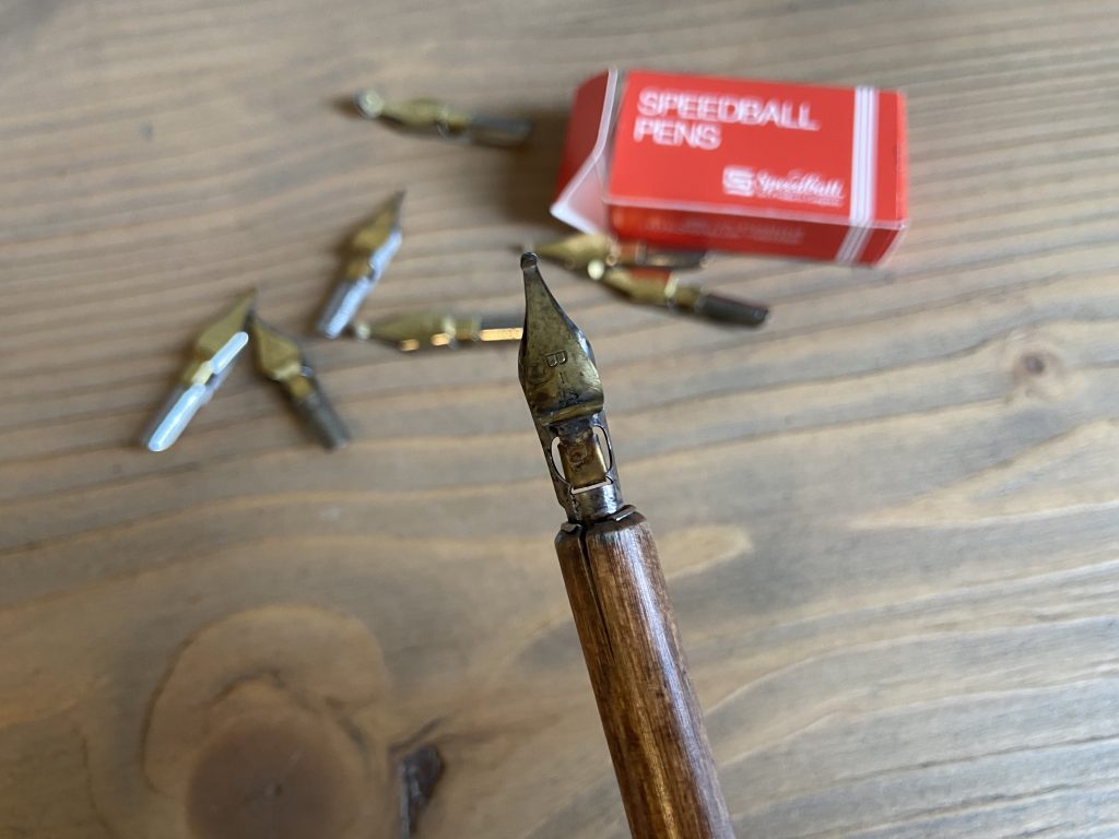
This is the monoline nib I used for practice. It’s the Speedball monoline nib in the size B-4. You don’t really need to purchase the entire monoline nib set unless you are taking a calligraphy workshop that explicitly states that you need more than one size. To be quite frank, I used the other sizes for all of one workshop and haven’t touched them since. Arguably that’s my own fault for not making good use of them, but whenever I feel like exercising with monoline nib I just grab this B-4 and practice with it, because I don’t really feel the need or desire to switch to another size. As you can see I haven’t taken very good care of it, and honestly I haven’t even taken it out of the wood nib holder. The wood holder has cracked a little bit because I haven’t taken out the nib to let the whole thing dry out properly, but it still serves it’s purpose quite well. Sometimes it’s nice to have a tool that’s not high maintenance. Just a single nib and a cheap wooden holder for a couple bucks and you’re set for many years.
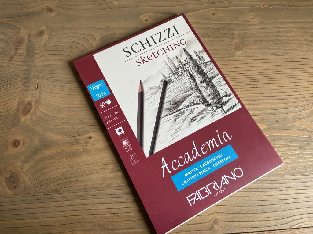
This is the paper that I prefer. However, I got this sketchpad when I was still living in Korea, and I don’t see it on Amazon or readily available in the US. I imagine it’s easier to find in Europe. The closest thing by the same brand that I can find appears to be this Fabriano Ecological Artist Sketchpad, but I have not tried that one yet. I will update this posting once I have tried it. I guess the main point is to use a paper that can absorb the ink you use. Preferably one that has a bit of texture to it so that your nib is not slipping and sliding all over the place. If you already have a preferred paper or your teacher is recommending a different one, by all means feel free to use the paper of your choice!
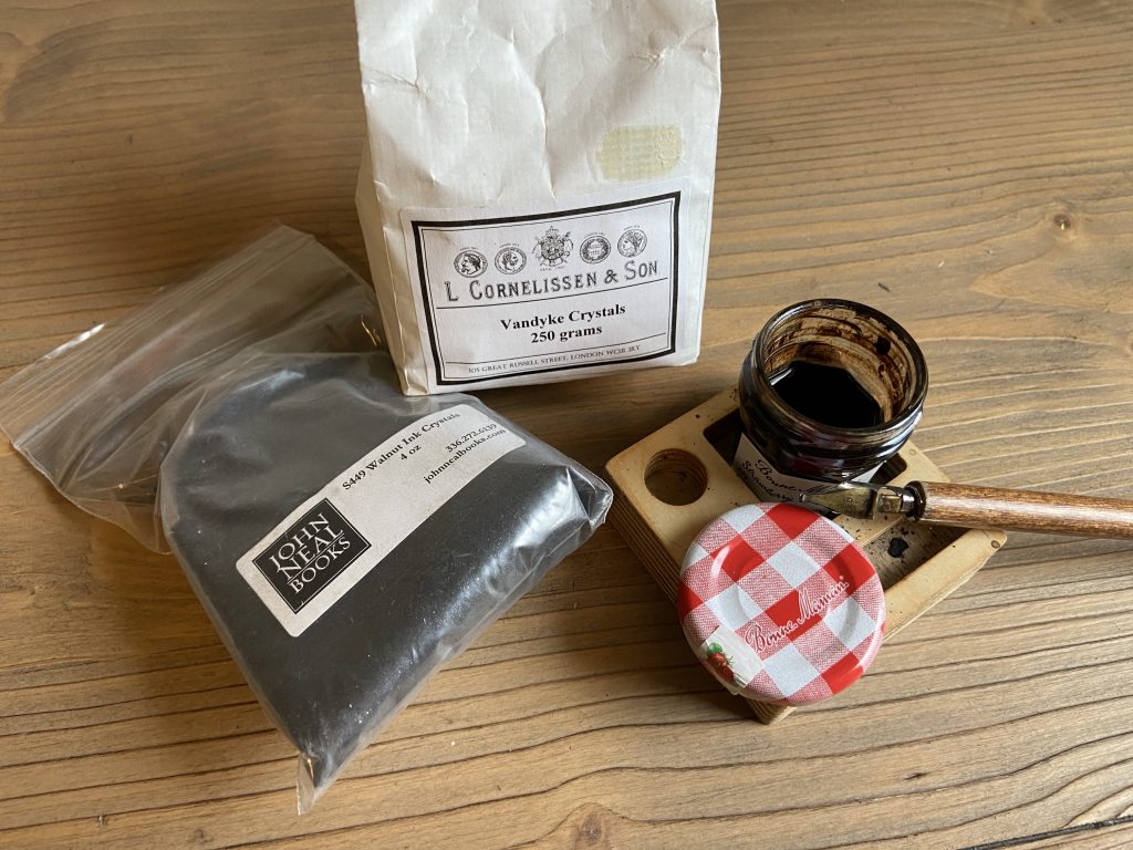
I prefer to use Walnut Ink when practicing because it’s a beautiful color, and because a bag of walnut crystals and it will last years and years so it is quite economical. If you’re in the U.S. you can buy it at John Neal Books online, and if you’re near London you can get them in a plastic free paper bag at L Cornelissen & Son. I find that a mini jam jar is perfect for holding my walnut ink.
*It has been brought to my attention that for certain email carriers the commerce platform is unable to deliver the download link. If you have any problems receiving your product, please email me at silentlyfree at gmail dot com, and I will email the files directly. Thank you for your patience and understanding.
*Disclaimer: nib, nib holder, paper, desk is not included with this purchase. Purchase only includes the digital pdf files of the guidelines only. I have set the settings to unlimited downloads, but to be safe I recommend that you backup the files onto several different locations (usb, external hard drives, Google drive, Dropbox, etc). You are welcome to print off as many as you’d like for your own practice, but please do not distribute for free or for personal gain.
Reviews
There are no reviews yet.